
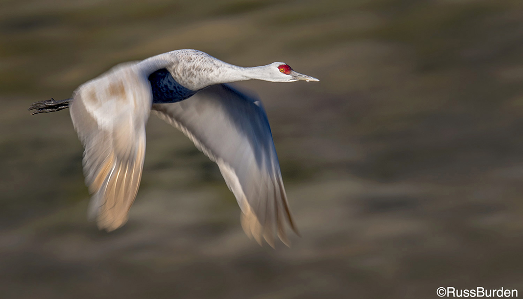
Read Next
10 Action In Nature Quick Tips
As you know, nature photography isn’t...
Critically Sharp Captures
To obtain excellent-quality, tack-sharp...
Get Drenched In A Downpour Of Pixels
Get Drenched In A Downpour Of Pixels
Over 70 percent of the Earth’s...
Do Away With Gray
In the image of the egret, photographer Seth Wagner captured the bird spanning its wings while attempting to catch its balance. To keep the highlights in the wings and head of the egret, Wagner slightly underexposed the shot, which, in conjunction with the overcast sky, led to color problems in other areas of the image. These kinds of gray days already offer very little contrast for your images and can be overemphasized by digital sensors, as opposed to film cameras.
When editing an image, it’s always best to work in layers instead of applying all of your adjustments directly to the original image—if you make a mistake or want to remove an effect, it’s as easy as throwing away a layer and creating a new one. Also, make sure you name all of your layers as you go. This keeps your steps organized and makes it easier to spot which adjustment is where. Here, I made the adjustments in Photoshop, but all of these steps can be done in Photoshop Elements and Paint Shop Pro as well. To label layers in later versions of Photoshop, simply double-click on the layer and rename it. In earlier versions, a box will pop up when you double-click and you can change the name there.
Contrast
The first step to take with a flat image like this one is to adjust the black and white points using a Levels adjustment layer—the image will gain contrast immediately. Using a Brightness/Contrast adjustment is too heavy-handed and often can lead to an image that has too much contrast or contrast in the wrong places. By adjusting the black and white points using the Levels threshold screen, you can accurately see where the blackest and whitest points are in your image. This ensures a more balanced tonal range and offers you better color.
Access adjustment layers by clicking on the black-and-white circular icon at the bottom of your Layers palette (this is the Adjustment Layer icon), or by choosing Layer Menu > Layer > New Adjustment Layer > Levels. To use Levels for black/white control:
• Hold down the Alt/Option key as you move the sliders to activate the threshold screen. This shows where blacks or whites appear in the image.
• Move the right slider until you see the white highlights peeking through the black threshold screen. This sets the white points and leaves detail in the highlights.
• Move the left slider until you see black points peeking through the white threshold screen. This sets your blacks.
• Click OK.
• After this adjustment, click the eye icon for the layer to turn on and off so you can see the difference in contrast. Now there’s much more depth in the image and the color is improved.
Midtones
Next, adjust the midtones using a Curves adjustment layer. Choose Layer > New Adjustment Layer > Curves, or click the Adjustment Layer icon, then Curves.
• Click on a midtone point on the curve and drag it up or down until the overall brightness looks right. Watch the highlights so they don’t get too bright.
• Click OK.
Color
The egret image here is predominantly monochromatic—it doesn’t have a lot of color. When we make any subtle color adjustments, none of the bright, saturated colors are affected. Be mindful of how color can change shadow areas, however, like those underneath the wings. These areas could look like blobs if you’re too heavy-handed with your Levels, Curves and color adjustments.
Because this image was shot on a cloudy day, I decided to add a bit of warmth to liven it up. There are a few ways to add subtle color without affecting your shadow areas negatively.
In the newer versions of Photoshop, you can add an adjustment layer called Photo Filter. When you create this, a box with a set of preset filter options pops up—choose one of the warming filters, such as 81. In the same pop-up box, there’s an option to create a custom color filter. Click on the color button and use the color picker to choose any type of color you like. Changes in density can be adjusted via the slider so you can create a strong or subtle filter.
If you have an older version of the software that doesn’t have the Photo Filter effect, there are still a couple of ways to warm the photo. Here’s one technique, using another Levels adjustment layer:
• Click on the gray eyedropper in the center (this isn’t a middle-gray eyedropper, but a neutral-tone tool).
• Click the eyedropper around the perimeter of the image, and you’ll notice the tones of the image changing. By clicking on a cool gray tone, the tool will remove that blue tone, effectively warming up the image.
• Click OK when you’re satisfied.
The other technique is to create your own photo filter. This lets you control the saturation, color and effect that it has on the overall image. To do this, create a Color Balance adjustment layer:
• Go into Layer > New Adjustment Layer > Color Balance.
• With the Midtones checked, move the red and yellow sliders in equal amounts until you’re satisfied with the color. A subtle warmth can be achieved by adding about 5 to 10 points of each color.
• Click OK.
If you want your image to remain true to what was shot, be subtle with your adjustments. You can move the opacity slider in your Layers palette to control the effect even further.
Finishing Touches
Now that the overall gray image has good tonality, contrast and color, it’s time to put some finishing touches on the image, such as localized tonal control and dodging and burning. I like to dodge and burn at the end of my workflow because I can see the final image unfold and stop when I’m satisfied.
For the egret image, I wanted to burn or darken the edges to add depth to the image and make the egret stand out. This is a traditional darkroom technique that works effectively in Photoshop. You can dodge and burn by hand, but for a more even effect, use a Brightness/Contrast adjustment layer with a layer mask (Layer > New Adjustment Layer > Brightness Contrast).
• Drag the Brightness slider to the left to darken the image by 20 to 30 points (this can easily be changed later).
• Click OK.
• Fill the layer mask with black (Edit > Fill > Black). This turns off the effect. A layer mask works very simply—black turns off anything the layer is doing; white turns it on.
• With your foreground set to white, use the Brush tool to paint in the darkening effect. Paint around the edges of your subject and in the corners of the image. Try using different-sized brushes and softness to create dimensions of depth. If you want to reverse the darkening effect, change the foreground color to black and brush over what you want to lighten.
Once you complete your edge burning, you can further control the darkening effect by dragging the opacity slider of that layer down until you like the results. If the effect isn’t strong enough, double-click the adjustment layer icon of the layer and readjust the Brightness slider.
Finally, compare your finished image to the original by holding down the Alt/Option key while clicking on the background layer eye icon. This shuts off the other layers to reveal the original. Click the layer on and off and notice that it looks as if a sheer blanket of gray has been lifted off of the image. Your image now pops with subtle tones, contrast, color and depth.