
Read Next
10 Action In Nature Quick Tips
As you know, nature photography isn’t...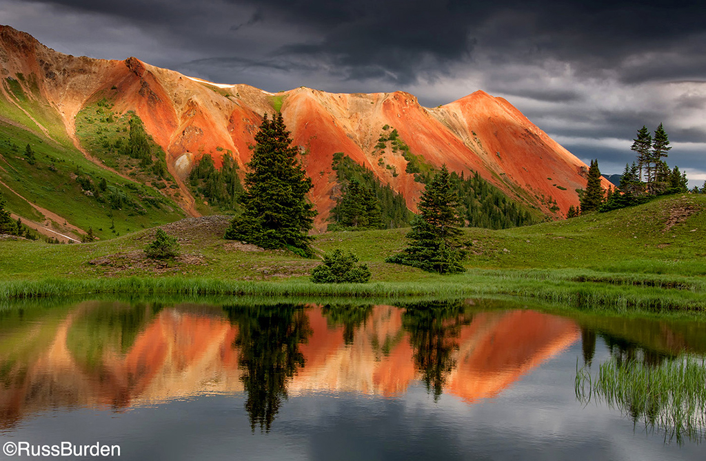
Critically Sharp Captures
To obtain excellent-quality, tack-sharp...
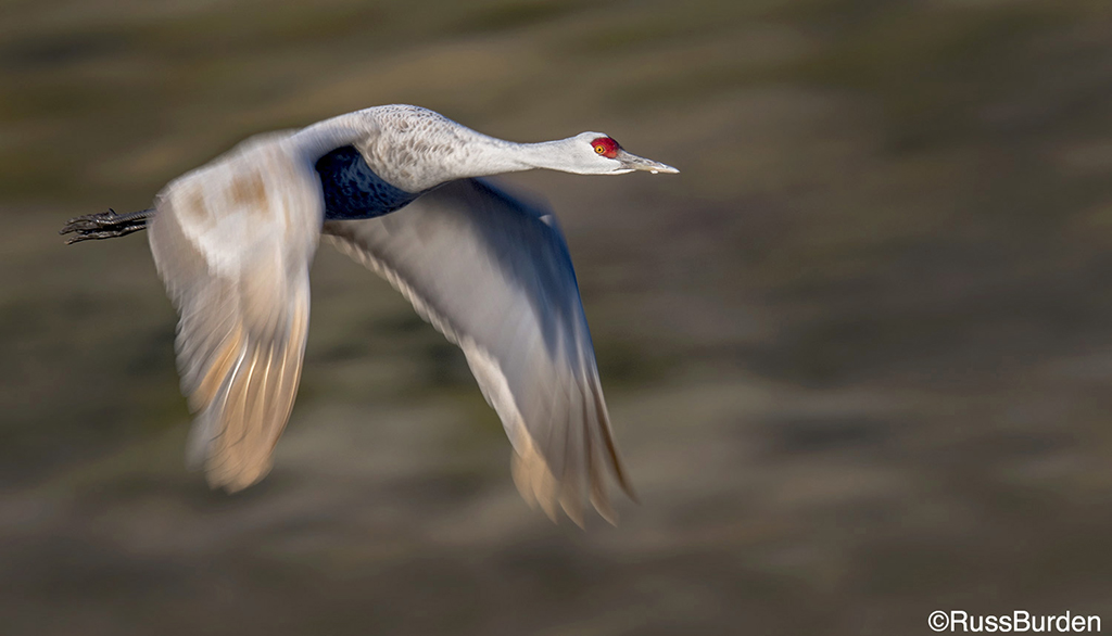
Get Drenched In A Downpour Of Pixels
Get Drenched In A Downpour Of Pixels
Over 70 percent of the Earth’s...
Matching The Monitor
As you delve into digital image work on the computer, you’ll hear a lot about color management. To be honest, some of the information is valuable and some of it’s a bit obsessive. However, to get a good-looking image, no matter its end usage, you must calibrate your monitor. Adobe products include a simple calibration tool, but for the most accurate work, consider a monitor profiling tool such as the ColorVision Spyder. I mention it because it has came down in price to $149, making it the first unit of its type to be affordable for nearly anyone.
•A monitor’s colors are made up of glowing red, green and blue pixels, while a print’s colors are created by light that must reflect through cyan, magenta, yellow and black dyes or pigments and white paper.
•Since monitors and prints can deal with color in dissimilar ways, colors on a monitor often will show slightly varied emphasis compared to prints, which will show up stronger when different papers are used.
•Inexpensive LCD monitors can be difficult to control when it comes to color.
•Since no one ever puts a monitor on the wall for displaying prints, a critical issue is how an image looks as a print, not just how good it appears on the monitor.
The key to successful printing is a good print. Think about it—although some photographers are excessively concerned about matching a print to the monitor, people viewing the print won’t ask to see the monitor so they can compare them. Still, it’s important to have an accurate monitor that responds in a consistent way so changes you make on the screen are reflected properly in a print.
Calibrate. For your monitor to be consistent, you should calibrate regularly (at least every month or so). What you want is a monitor that shows tonalities (dark to light) accurately and keeps neutral tones neutral. Adobe Photoshop and Photoshop Elements come with Adobe Gamma, a calibration wizard that takes you, step-by-step, through your monitor setup. It’s a good program that’s built into the software, but it’s quite basic and relies on human judgment (our eyes and brain can be fooled at times into thinking colors are different than they are).
For more control, you need a sensor you can attach to your monitor, such as the ColorVision Spyder (www.colorvision.com), GretagMacBeth Eye-One (www.gretagmacbeth.com) and Monaco Optix (www.monacosys.com). This device actually will read your monitor and, through software, create a profile for it (a profile is a set of instructions the computer uses to interpret color). You need to be careful, however, that the sensor you buy works on the type of monitor you’re using. Older-style sensors for CRTs (the big, tube-type monitors) can damage the soft screen of an LCD.
Once attached to a monitor, the sensor does its job automatically. You need to do little except watch a parade of unique colors and neutral tones that appear below the sensor. A software wizard will guide you through the proper steps. Once done, usually it will prompt you to save the profile. Most photographers will save it with a specific name related to the monitor and the date. This makes it easy to know when you profiled last (check your profiles in Windows by right-clicking on your desktop, selecting Properties, then Settings/Advanced and Color Management; for Mac, go to System Preferences, then Displays/Color).
Improve Your Workspace. Now, having bought a sensor and done the profiling work, it would be a shame to have that profile give you poor results because of your computer’s work environment. Our eyes tend to compensate for our surroundings, so the location of a computer monitor is important. If bright colors surround a desk, this can be a problem, especially if they change through the day because of the lighting in the room. You actually can get very different-looking images if one is done in bright conditions during the day and another at night when the room lamps don’t illuminate the bright colors the same. Use neutral colors around your monitor as much as possible.
In addition, be mindful of the quality of the ambient light. If it’s constantly changing, from sunlight to skylight to incandescent, you may find your prints looking different when printed at various times of the day, regardless of the color of the room. Again, your eyes will compensate for the light, so adjustments you make to your photo may look the same, say at noon compared to 8 p.m., but the actual results will be different. Your best bet is to keep the room somewhat dim, with light changes kept to a minimum (I keep blinds over my windows in my home and work offices; our art director keeps the blinds shut in his office all the time).
React To The Print. This is a key part of the printing process. Unfortunately, a lot of Photoshop gurus have so frightened photographers that they feel they must do everything the “right way” (based, naturally, on the guru’s advice) or an image won’t look good. You must be your own judge. Check the print when it comes out of the printer. Really study at it, without comparing it with the monitor, and decide whether you like it or not. No great darkroom worker ever took a print and tried to compare it with the negative to see if it was printed correctly. Use the monitor as a reference, but not as a benchmark.
Also, consider doing a final examination of the print after it has “dried” for a while. Although a print comes out of the printer dry to the touch, further drying occurs afterward (for how long depends on the paper). This means that certain tones aren’t fully “developed” for anywhere from minutes to hours. In addition, check your print in the light under which it will most likely be displayed. Photographers who sell prints need to examine their work under a consistent, color-balanced light source, since they can’t predict how their images will be displayed.
Test, Test And Test Again. Printing is a craft. The more you print, the more proficient you’ll become. Traditional darkroom photographers constantly tested to get the best prints, and we should do the same. Try a print and check it; make adjustments and see what effect they have on the print. Note your results. Any compensation you apply to the image for printing generally can be used as a starting point for all images on a particular type of paper (this is similar to adjusting your aim in archery to compensate for the wind; in this case, you do it with the colors and tones).
Traditional darkroom workers hastened the testing process by using a test strip. You can do something similar by creating a page that includes many small versions of your photo, then selecting and adjusting each image differently (recording your adjustments as noted above).
For example, you could arrange four 3×5-inch images on a single “canvas” (overall print area) that will print on one page of 8×11-inch paper. Most image-processing programs offer the convenience of an automated printing function (in Adobe products, look under the Picture Package section; check the Help menu for exact location). Be sure your resolution is set correctly. For your four-print page, keep the upper left unchanged, and adjust color and brightness differently for the others. Now, you’ll have a quick test print.
You also can use software to do this test print for you. Vivid Details Test Strip (www.vividdetails.com) offers a structured way of testing, as well as many color-adjustment tools.
OP editor Rob Sheppard’s website for workshops and Photoshop videotape instruction is www.rsphotovideos.com. His latest book is the National Geographic Guide to Photography—Digital.