
Read Next
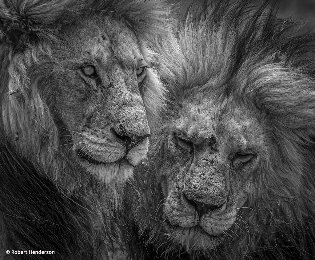
Photo Of The Day By Robert Henderson
Today’s Photo of the Day is...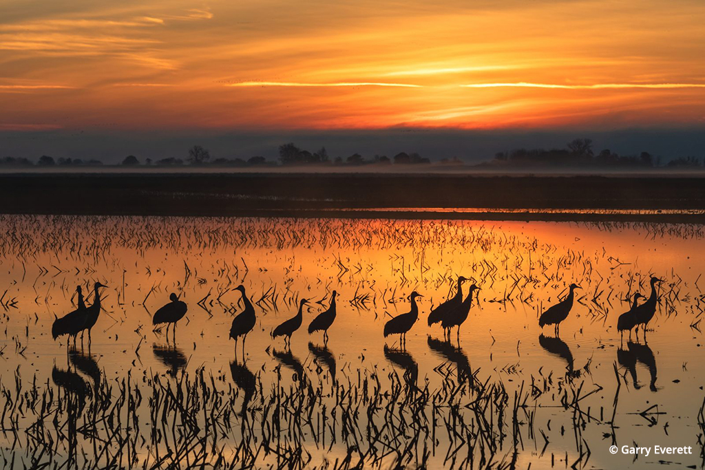
Photo Of The Day By Garry Everett
Today’s Photo of the Day is...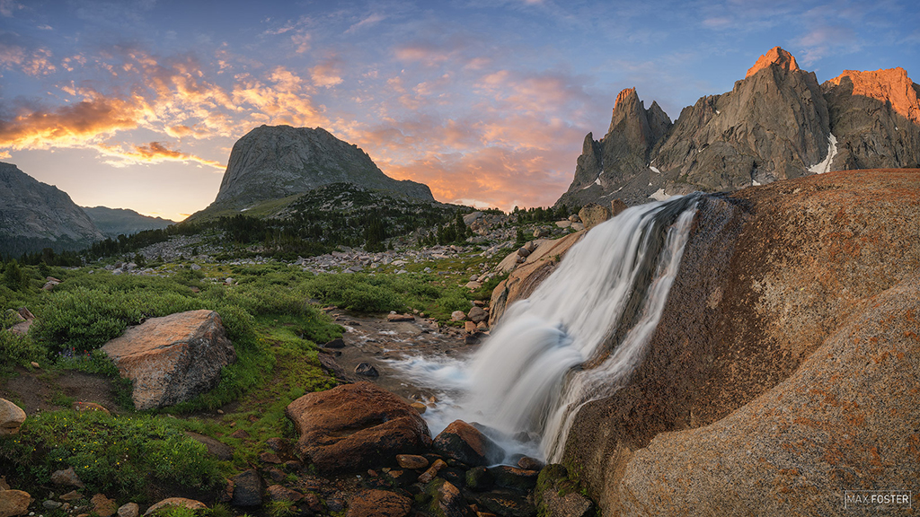
Photo Of The Day By Max Foster
Today’s Photo of the Day is “The...
The Seduction Of Saturation
Color is something that gives nature life. Certainly, black-and-white photography is fun and a great way to photograph, but it doesn’t represent nature the way that color does. For that reason, nature photographers have long used enhanced color films, from Kodachrome to Velvia, to make the colors of nature really pop.
Paul Simon’s lyrics…
Kodachrome,
They give us those nice bright colors
They give us the greens of summers
Makes you think all the world’s a sunny day, oh yeah
…didn’t come from the idea that Kodachrome gave pure, documentary colors.
Wanting great color from the outdoors is a natural thing. As photographers who love nature, we want to put it in its best light. But the quest for brighter, more saturated colors has brought some new problems for the digital photographer.
You may have noticed that Canon ran a photo contest recently for photographers to win a Digital Rebel XT. The editorial staff went through all of the entries to pick a winner. While there were many great shots, too many were marred by one particular thing: overuse of the saturation control in the digital darkroom.
This isn’t an uncommon problem. The allure of more color seems to affect amateurs and pros alike. Not too long ago, we received a beautiful book of photographs from a well-known photographer who had the colors pushed way beyond what looked appealing. I’m not sure where some of the skies came from because they certainly don’t exist on this planet.
I don’t believe this digital pushing of color is usually done to deceive anyone or to “improve upon nature.” Color is seductive, and when photographers discover a tool that intensifies and enriches color, the temptation is sometimes just too much.
It happens subtly and is a bit like the well-known frog and hot water story. If you put a frog into hot water, it will jump out immediately. On the other hand, if you put a frog into lukewarm water and gradually heat it, the animal will stay in the water until it dies. Or consider Las Vegas: If there’s a chance to lose $1,000 instantly, most people would jump out of that bet immediately. On the other hand, Vegas casinos are powered by people who have lost thousands of dollars one small bet at a time.
The saturation tool in any image-processing program is like that. You crank up the color a little, step back and think that looks good. But then your eyes get used to the change and it sure seems like a little more saturation could be just what the photo needs. It looks good, but as you study the image, your eye adapts to the color and once again that siren song of the saturation tool is calling to you: “Just a little more.” Before you know it, the photo is oversaturated and you can’t see it.
So how can you combat this temptation that lures unwitting photographers onto the rocks of garish color? The first step is to recognize this danger, then look for it to happen in your photos. There are two tools that I use regularly to watch what’s happening to my image as I work on it in Photoshop: the preview and layers.
The preview for most controls in Photoshop is a very important way to see what’s going on in a photo while you adjust it, but also to compare your adjustment to the unadjusted image. Turn the preview on and off to compare what you’ve done to what the photo looks like with the adjustment undone. This can tell you a lot about the strength of your adjustment.
Layers is another important tool because when you put your saturation changes onto a separate layer (with a Hue/Saturation adjustment layer, for example), you can turn that layer on and off to see its effects. You then can turn the adjustment down by either changing the actual adjustment if you used an adjustment layer or by reducing the opacity of the layer.
I like how nik Color Efex (www.nikmultimedia.com) deals with color saturation better than Photoshop’s saturation control. It’s called Brilliance (it’s combined with Warmth; you can add or subtract warmth in the image while affecting saturation), and it can’t be used as an adjustment layer; however, it can be applied to a separate layer, and then you can change the layer opacity to get the colors right.
Your workflow can inadvertently affect color saturation of an image, too. I always work the tonalities (blacks, whites and midtones) of an image before adjusting color because changing tonalities affects color and the appearance of color (strong tonal adjustments can also artificially boost color; change the layer mode to Luminance in order to deal with that problem). If you change an image’s color saturation before you adjust tonalities, you may find that the color shifts in garish ways.
Another issue is related to the way individual colors are affected by saturation adjustments. It isn’t unusual to find that out of a group of colors, one or a few may be captured by the camera sensor or film in an undersaturated way compared to other colors in the image. Increasing the overall saturation just to compensate for these problem colors then can make the rest of the image look bad.
There are two ways of dealing with this challenge. First, use Photoshop’s Hue/Saturation control in its individual color mode. If you click on the arrow to the right of the master color box, a drop-down menu of individual colors appears. Select whatever seems closest to your problem color, then move your cursor out onto the photo and click on the color itself. This adjusts and limits the color range that Hue/Saturation will affect. Now you can substantially increase a particular color without changing the overall color saturation.
Second, use a layer and a layer mask (if you haven’t learned to use layers and layer masks, I strongly suggest you put in the time to learn them; they’re extremely valuable tools). Create a layer to increase color saturation of your problem color (you can do an overall color saturation boost or just for the color). Then add a black layer mask to the layer. If you have an adjustment layer, all you have to do is press Ctrl/Cmd and the letter I to invert the white layer mask to black. If you’re using a full layer (when using nik Color Efex, for example), press Alt/Option and click on the layer mask icon at the bottom of the Layer palette (that will create a black layer mask).
The black layer mask turns off the effect of the layer. Now paint in the saturation changes that you made on this layer, but only over the colors that you want to affect. You do this by painting with white on the layer mask (be sure you’re on the layer mask by clicking on it) wherever the problem color appears. You can use opacities for the brush of less than 100% for a more subtle effect. Use a large, soft-edged brush to paint on the layer mask. If you go too far, change your brush to black and paint out the effect.
This isn’t a science or technology. I can’t tell you how much you need to adjust your photos or how to use the layer mask most effectively; these are highly dependent on what’s in the photograph itself. As colors change through adjustment, they’re not changing in isolation. They always interact visually with other colors around them, so that as you change a single color, its relationship to surrounding colors also changes, which will affect how you see that color and surrounding ones.
If you want the best from your nature photographs, and especially when making prints, you need to pay attention to what colors are doing in a photo, especially their saturation. Be wary of extreme saturation changes and, if an individual color needs a big change, work to limit that change to that particular color or area in the photograph. You want viewers to enjoy your images and be pleased by their color, not annoyed by garish contrasts.
OP editor Rob Sheppard‘s latest book is Adobe Camera Raw for Digital Photographers Only. His new website, www.robsheppardphoto.com, features photo tips and more.