
Read Next
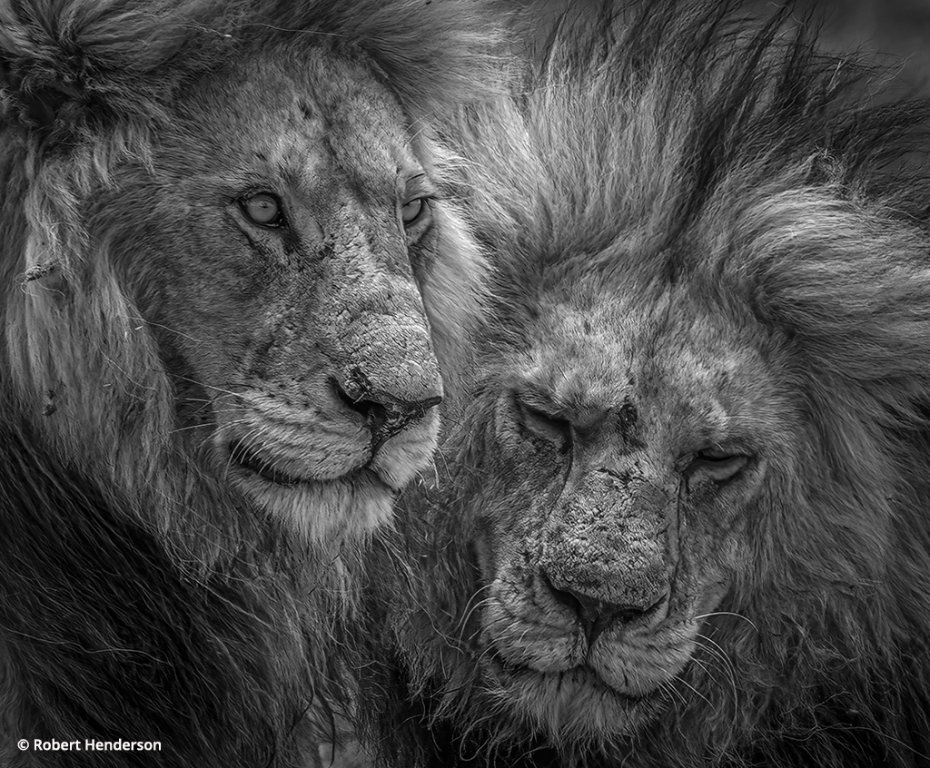
Photo Of The Day By Robert Henderson
Today’s Photo of the Day is...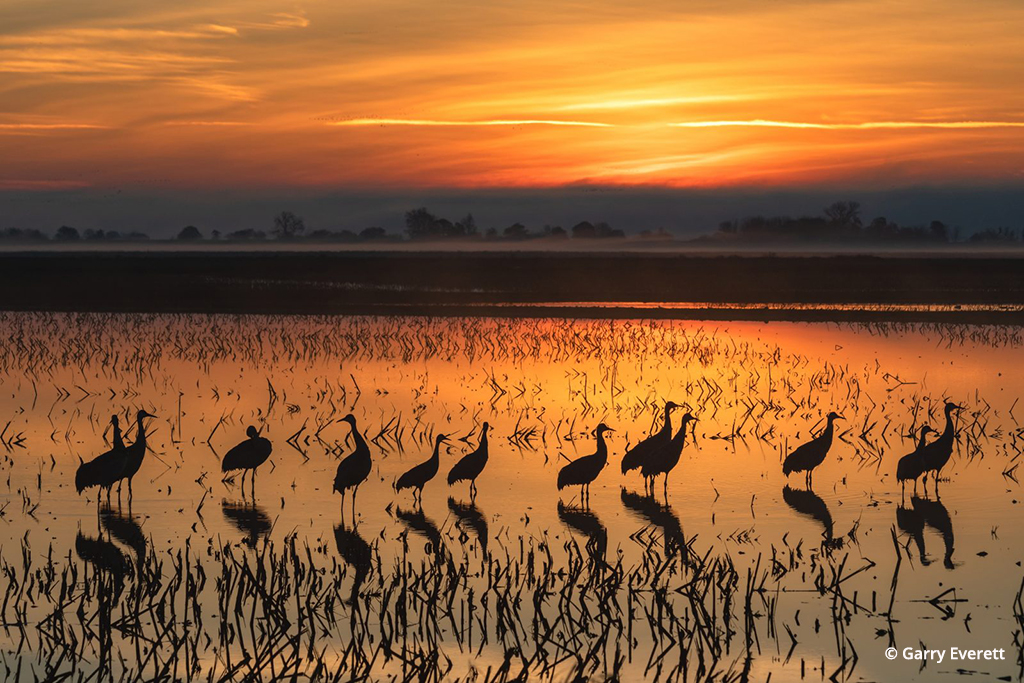
Photo Of The Day By Garry Everett
Today’s Photo of the Day is...
Photo Of The Day By Max Foster
Today’s Photo of the Day is “The...
The Better Print
What’s a good print from your photo? How can you make one better? Many people will answer that a good print matches the monitor and a better one matches it better! There’s no question that having a properly calibrated monitor is critical to getting a quality print, but simply saying a print must match that monitor in order to be good is misleading to the goal of getting a better print.
To make a better print, it’s important to keep that idea in mind, that a print is a different thing than the monitor. While it’s possible, how often have you seen people displaying monitors on a wall? A monitor gives a feeling of looking into an image, while a print has more of a feeling of looking at an image. Those are psychologically quite different impressions. We also tend to look at both from different distances.
In addition, the size of an image tremendously affects how you react to it. Everyone responds differently to a 4×6 compared to an 11×14-inch print of the same subject. You can make your on-screen monitor close to the print size for 8×10 and smaller, but for larger photos, you have a problem. Even if you have a very large monitor, you won’t fit a 12×18-inch vertical full size on your screen. Even if you could, your viewing distance would be skewed. And if you’re printing bigger prints, you’ll never do it in any orientation.
A monitor, ultimately, can only be a guide for what a print should be. To get the most from your printing, and truly to get a better print, we need to go back to the true craftsmen of photographic printing, like Ansel Adams. Adams’ books, especially The Negative and The Print (published by Little, Brown & Co.), offer a lot for the digital photographer who wants to make better prints.
A good print comes from craft, not simply science and technology. I don’t care how much color management is involved, what printers are used or how Photoshop is set up, it’s what’s in the print and how it’s expressed that matters. To paraphrase master photographer Jay Maisel, it’s not how much technology you use for a print, but what you put into the print that matters. Of course, the technology is important, but craft means mastering the technology for your use, not letting technology master you.
One way that can happen is to consider the first print you make to be a proof or work print, as Adams did. In The Print, he writes, “Arriving at a ‘fine print’ involves proceeding through various stages of ‘work prints’ until you arrive at a rendering that looks and feels right in all ways.” He also writes, “The differences between the various stages of work prints leading to the fine print are often subtle, and require meticulous craftsmanship.”
Further on in that book, he says something that absolutely applies to digital printing: “The technical issues of printing must not be allowed to overwhelm the aesthetic purposes: the final photographic statement should…transcend the mechanics employed.”
After this past year’s NANPA meeting, I had a discussion about digital printing with John Sexton, the master black-and-white photographer and one of the finest printers working today. He says that one of the reasons photographers don’t get the best prints from digital processes is that they don’t print early enough.
What he means is that photographers try to do everything in the computer, watching the monitor for changes, then try to simply match the print to the monitor. This causes problems, as described above, because a print isn’t the same thing as the monitor. You need to see what an image looks like as a print to truly evaluate what it needs as a print.
I know this means making more prints, but if you want the best print possible from your photo, it’s worth doing. It’s actually far faster and cheaper to do multiple work prints in the digital darkroom than in the traditional wet darkroom, especially concerning color prints.
I did a workshop last fall, for example, and a student printed a wonderful image of a captive bobcat that matched the monitor pretty well. There’s no question that he had a good print. But we had discussed going beyond the good print to get a better image, and he did some print tests. He found that warming up the image made the fur on the animal come alive and made a great improvement to the print.
More than once I’ve made a print and discovered things in the print that I thought were but small distractions on the monitor becoming big problems with the print. In the photo shown here, I had some dark areas of the image in the water and rock that, when brought up to the right balance of brightness with the rest of the image, revealed a lot of noise. The photo was made with an advanced compact digital camera (Canon PowerShot G6), and these cameras have sensors that are definitely more sensitive to noise.
I didn’t see the noise on the monitor for a few reasons. One, the monitor was smaller than the print, and two, the experience of seeing the glowing colors on the monitor distracted me from really seeing the problem of the noise (even when the image was enlarged). After making the print, I went back to the image and saw the problem. I had to go back and do two things: change how I brightened the dark areas and use some noise-reduction software (I used Kodak ASF Digital GEM™ for this, as it’s a quick and simple noise-reduction software that works well for this sort of thing).
Another example: I spent a bit of time adjusting a miniature landscape of moss and lichens to bring the best out of the image (“Digital Horizons,” OP, January/February 2005). I ended up making some 12×16-inch prints from it that I loved, but the first prints revealed a balance problem. The left side had some extra brightness due to the way the scene curved over the rocks, which distracted from the experience of the print.
Ansel Adams always warned photographers about bright edges taking the viewer’s eye off the main composition and even off the print itself. So I darkened that edge. Should I have noticed this on the monitor? It certainly had some extra brightness on the left side that could be seen on the monitor, but I didn’t think it was a problem then. For the print, I darkened the edge. And I even liked the photo on the monitor better because the tonalities were more in balance. Sometimes it takes a print to help you see an image for what it really is.
Perhaps that’s a sign of being from the baby-boom generation. I can’t imagine enjoying reading a book on a computer, for example, but perhaps my children will someday. A book in the hand is a different experience than a book on a monitor. The same goes for magazines and other publications. While I get some news from the Internet, I don’t enjoy reading magazines in that form.
Maybe in the future, sheet-based prints as we know them won’t exist. Maybe we’ll just hang monitors on the walls for all of our photographs and the images will change constantly. For now, we use prints. And prints aren’t the same as monitors, no matter what we do to either, so they need to be evaluated as prints in order to get the most from them.
OP editor Rob Sheppard’s latest book is the PCPhoto Digital Zoom Camera Handbook, a guide to getting the most from advanced compact digital cameras.