Color Secrets

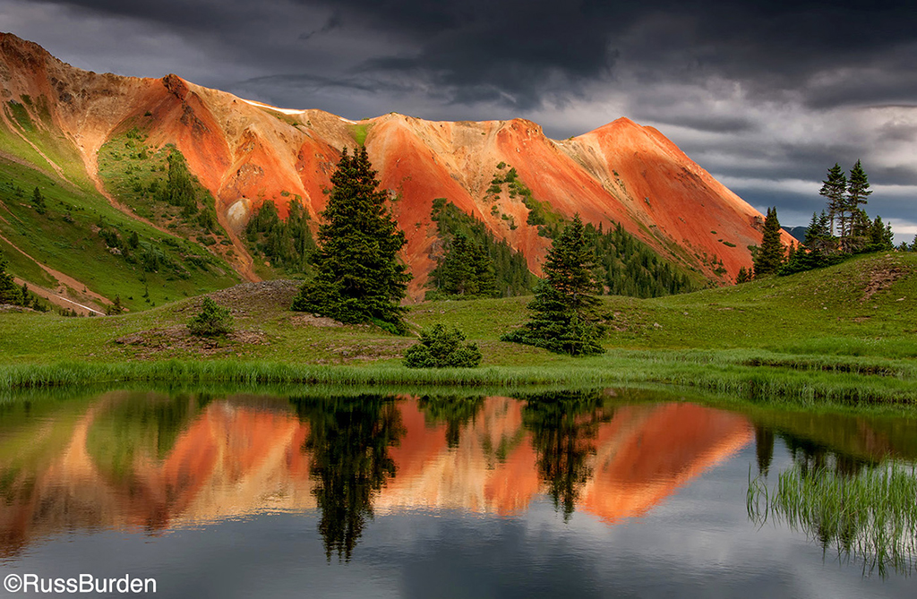
Nature photography has a long tradition of use of strong color. Kodachrome, then Velvia, were chosen for their high-quality sharpness and tonality—and for their color. Both boosted natural colors, intensifying and typically warming them up.

The Seduction Of Saturation

Color is something that gives nature life. Certainly, black-and-white photography is fun and a great way to photograph, but it doesn’t represent nature the way that color does. For that reason, nature photographers have long used enhanced color films, from Kodachrome to Velvia, to make the colors of nature really pop.

Do Away With Gray

The Better Print

What’s a good print from your photo? How can you make one better? Many people will answer that a good print matches the monitor and a better one matches it better! There’s no question that having a properly calibrated monitor is critical to getting a quality print, but simply saying a print must match that monitor in order to be good is misleading to the goal of getting a better print.

Go With The Digital Flow

We develop routines to get things done more quickly and efficiently in all areas of our lives. Many photographers have found that the digital process has enough differences from film that they have had trouble developing a routine that ensures a smooth workflow. Examining the whole process, from preparation for a shoot to sharing photos, is essential.

Matching The Monitor

As you delve into digital image work on the computer, you’ll hear a lot about color management. To be honest, some of the information is valuable and some of it’s a bit obsessive. However, to get a good-looking image, no matter its end usage, you must calibrate your monitor. Adobe products include a simple calibration tool, but for the most accurate work, consider a monitor profiling tool such as the ColorVision Spyder. I mention it because it has came down in price to $149, making it the first unit of its type to be affordable for nearly anyone.